Fred D. Thompson U.S. Courthouse and Federal Building
Fred D. Thompson U.S. Courthouse and Federal Building
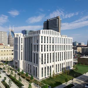
The Courthouse and Federal Building is located in a downtown metropolitan neighborhood, formerly populated by parking lots and old office buildings, that is undergoing rapid revitalization. Imposing and elegant, the building celebrates the role of the public in justice along with ideas such as transparency in government.
When the design process started in 2002, many courthouses were modern in design. While the U.S. General Services Administration (GSA) wanted a modern-looking building, the court representatives wanted it to be classical in style. The joint venture lead design team found a middle ground: a blend of classical and contemporary characters that connects the past to the future.
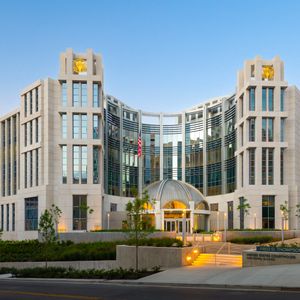
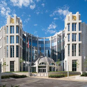
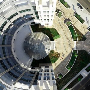
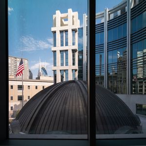
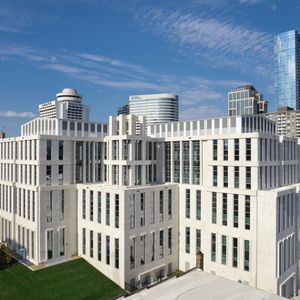
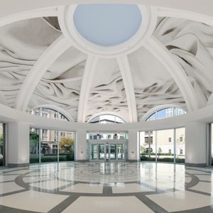
The façade features a grand curved wall with the entry rotunda at its center. That transparent curve reveals the public circulation, visible from the street, leading to the building’s six District Courts and two Magistrate Courts. The two flanking towers contain the jury suites.
The GSA wanted the courthouse to have significant gravitas to reflect the importance of justice in our society and express a degree of transparency and accessibility to all people in a democracy.
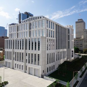
The clean, crisp lines and the contrast between the solid surfaces and the glazed surfaces are very striking plays on solids and voids. The hemicycle curtain wall at the northeast corner, which is the backdrop for the main entrance at the rotunda, is also a striking contrast to the precast walls on every other elevation.
The design for the new courthouse and federal building was completed in 2006 and went out for bid in 2007. When the economic bubble burst in 2008, the project (among other U.S. courthouses) was temporarily put on hold. Funding wasn’t granted until 2015 and by then, the lead Joint Venture design architect — was facing new criteria that Congress had set for the GSA.
The original design featured a 7-story building with a basement for parking and a penthouse for mechanicals. After the project was revived in 2015, the government changed the program and shaved two floors off the building.
Like many new courthouses that restrict public circulation to one part of the building while securing the rest, the public areas of the courthouse have a lot of glass to represent transparency.
A unique design feature involved the placement of the jury. Typically, jury suites are buried in the building. The designers did something no other courthouses are able to do by locating the jury suites as towers on the building with a lot of glass and daylight to celebrate the role that the public enacts rather than the judge.
While the building stands out as a stately and elevated institution in this context, its landscaped courtyard and art installation relate it to the pedestrian experience of its main street frontage.
The imposing structure is also designed to exacting requirements for blast resistance and progressive collapse.
Precast was chosen for its security, aesthetics, and durability. In addition, the versatility of precast allowed designers and engineers to incorporate the necessary design loads into the panels on the façade.
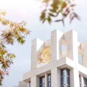
Beyond these practical considerations, the building presents a very stately presence that conveys the dignity and stability of the United States of America. The courthouse stands out from the urban context as an important institution. The white façades express the elevated and ideal position the court occupies in our society and government.
Finally, the main façade is composed in a balanced and symmetrical manner reflecting the need for balance in the Scales of Justice.
AWARDS
- (2024) ACI Excellence in Concrete Construction Awards: Mid-Rise Structures-Second Place
- (2024) PCI Design Awards: Sustainable Design Award
- (2024) PCI Design Awards: Government and Public Honorable Mention
- (2023) AGC Build America Awards, Federal & Heavy New Category
RELATED STORIES
VIDEOS
LOCATION
Nashville, TN
ARCHITECT
Fentress Architects | Michael Graves + Thomas Miller Partners Joint Venture


